UX Research • Dashboard Design • Subscription Retention • Figma
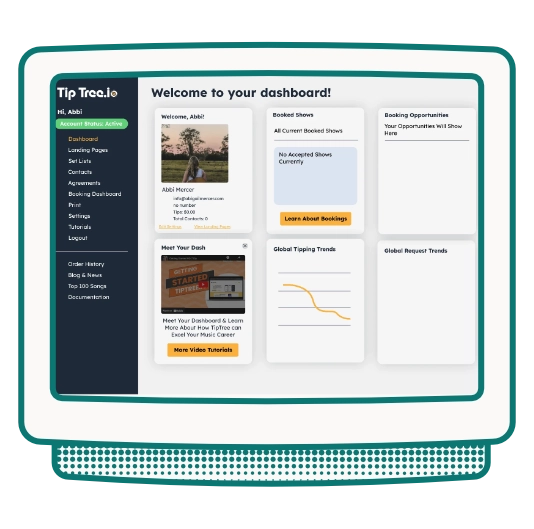
TipTree had a user dash in place already but it was causing user confusion and they found users didn't understand what TipTree fully had to offer which lead to users discontinuing their subscription. Users felt this platform seemed to be a glorified Tip Jar rather than a powerful CMS tool.
This process needed to do a deep dive into the frustrations of current subscribers so we put together a forum for current users to meet and I put together an extensive questionnaire to better understand pain points and how to best tackle these problems in the redesign.
Subscribers were treating TipTree as a glorified tip jar and churning when it didn't feel worth the cost. The dashboard was organized around how TipTree was built, not how creators think about running their business. Features existed but were invisible. The UX question wasn't 'how do we make this look better?' — it was 'why can't anyone find what they paid for?'
I designed a structured questionnaire and gathered 20 current subscribers into a facilitated focus group. The findings were consistent across all participants: users were confused by the dashboard layout, had no idea landing page hosting was included, and had never discovered the merchandise, fan data, or email tools. The information architecture mapped to TipTree's internal product structure: not to how a creator thinks about their work.

The redesign had one job: make the full value of a TipTree subscription visible from the moment a user logs in. Navigation was restructured around creator intent: Build, Earn, Grow, Manage ; rather than feature categories. Feature spotlights on the home screen surfaced unused tools contextually. Step-by-step walkthroughs and embedded video tutorials were placed at the exact decision points where the focus group reported the most confusion.

The previous design had poor visual hierarchy and didn't offer new users enough of a guide to show them all the features they can take advantage of with their subscription. The new design leaned in on personalization and tutorials.
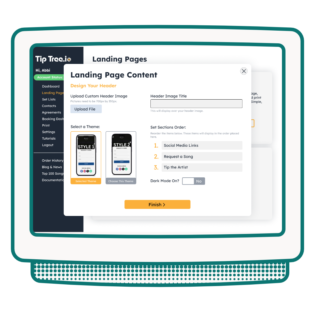
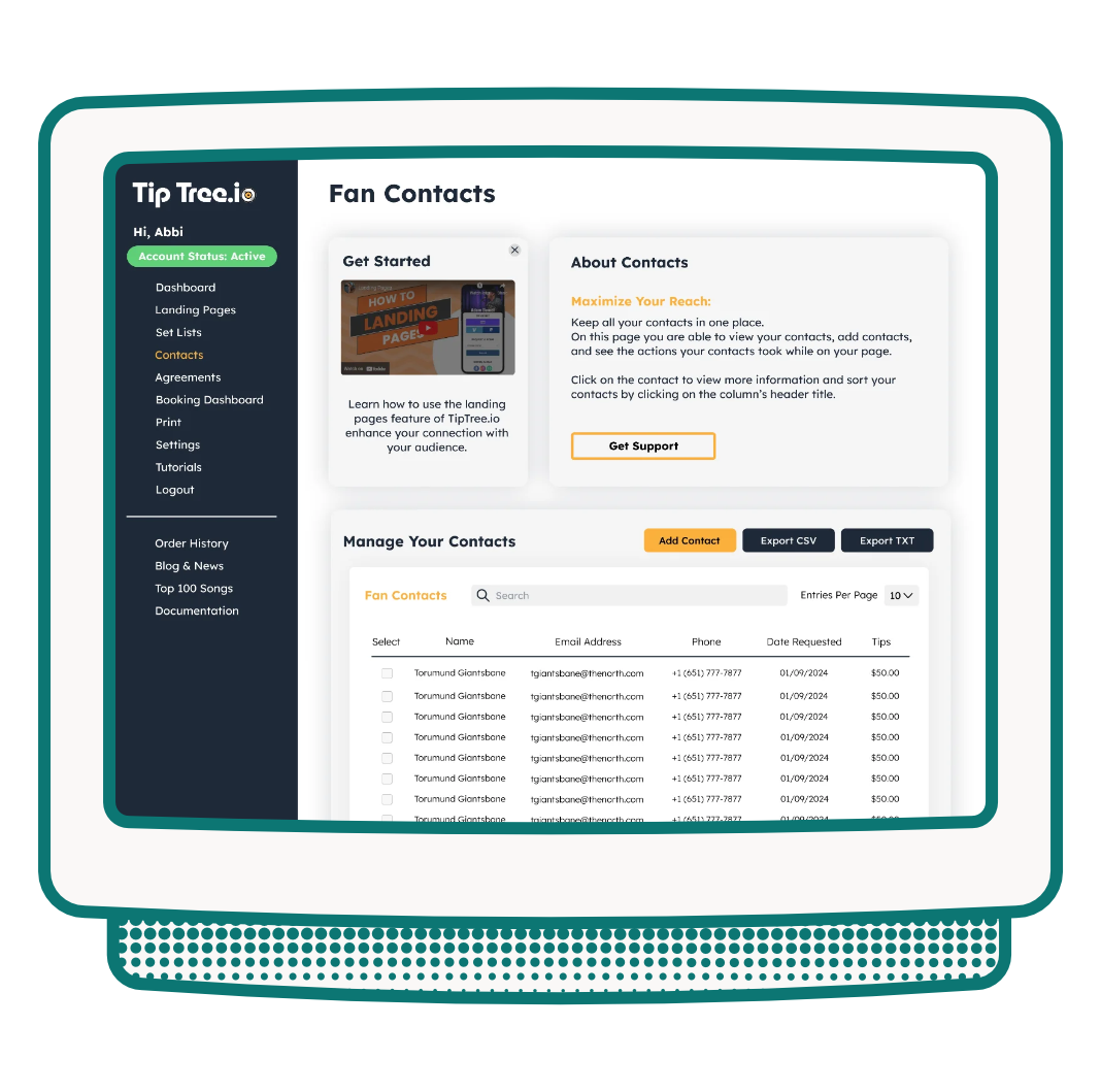
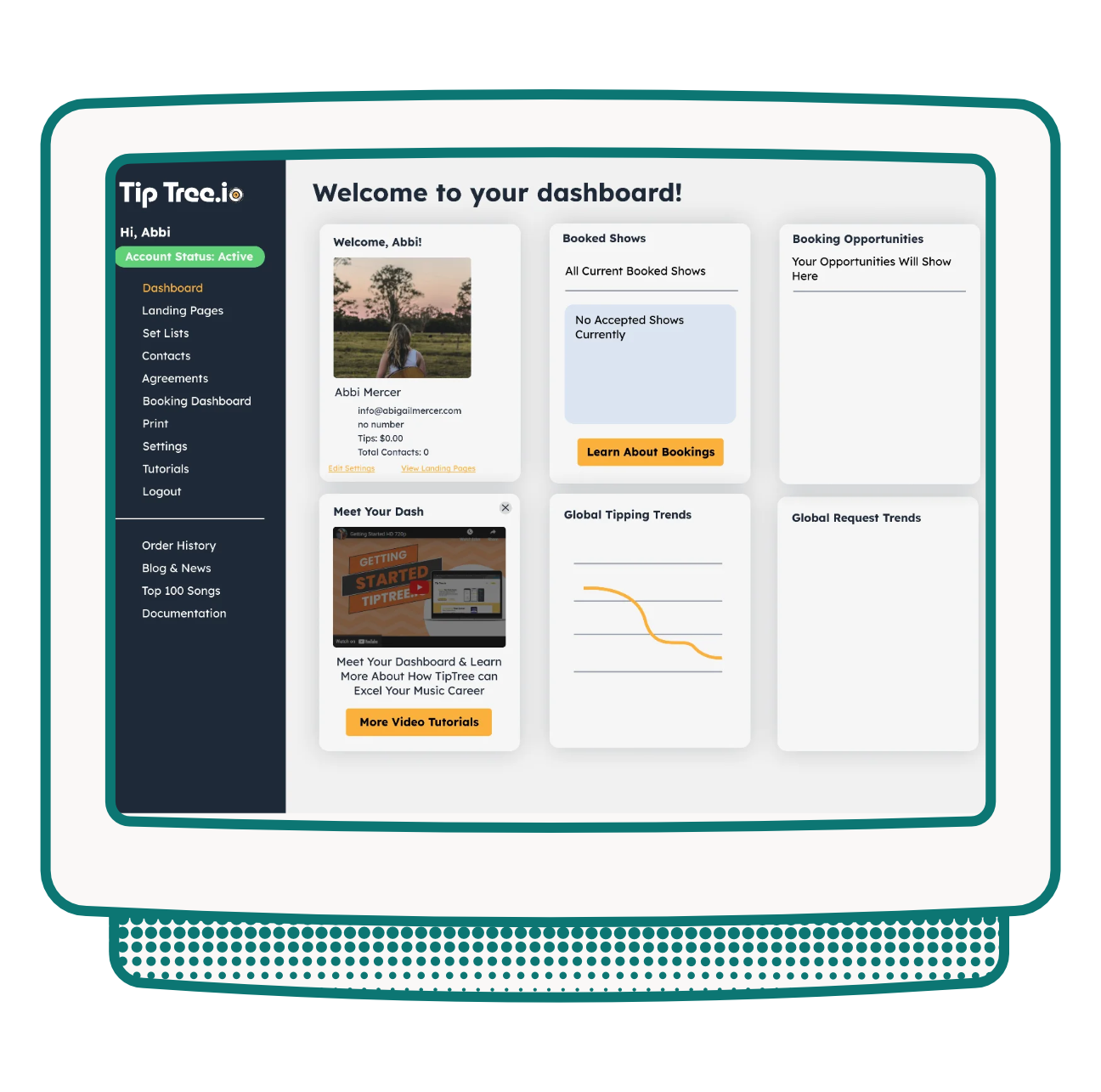
Post-launch focus group feedback confirmed the redesign achieved its goal: users were finally discovering and using the features included in their subscription. Users who had been treating TipTree as a tip jar were now building landing pages, selling merchandise, and running fan campaigns. The platform they paid for was finally the platform they were using — and churn dropped accordingly.