UX Audit • Information Architecture • Wix Studio (Velo) • White Label
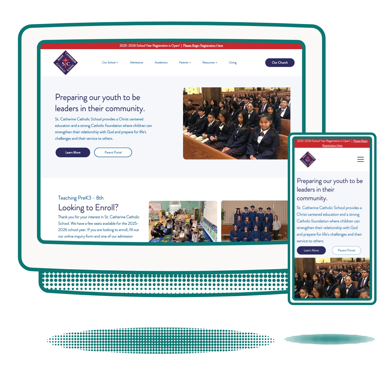
This client was a pro-bono website redesign client for Get Fish Slapped. Their previous site was outdated and confusing for parents and students to navigate. I was brought on to improve the overall user experience of the website as well as improve the navigation structure to make their user flows simple.
The site had accumulated years of inconsistency: more than three typefaces in use, student information filed under Administration, parent resources buried under student headings, a homepage video background that caused serious readability issues, and two competing navigation systems running simultaneously. Teachers' pages were especially chaotic, with no consistent structure across staff.
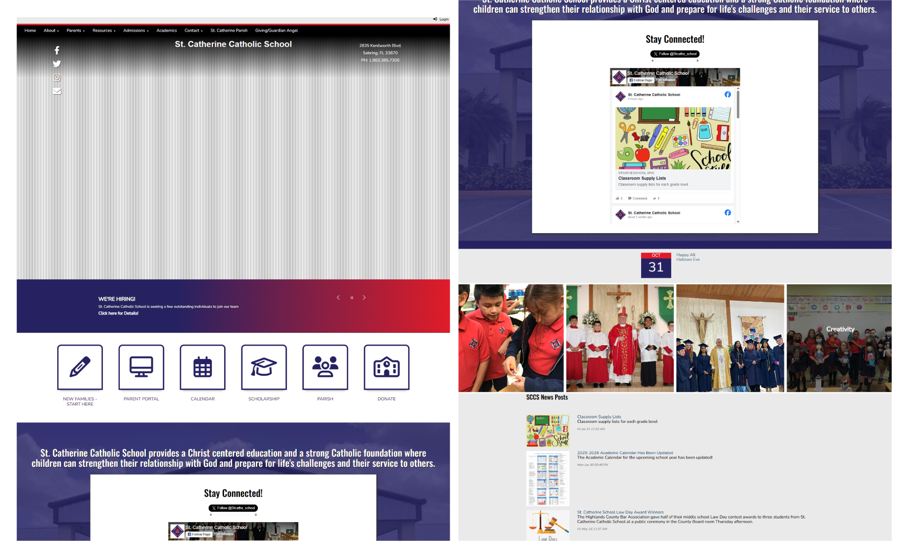
I screenshotted every page in full and mapped the entire site in Figma. ADA issues: the background video on the homepage created color contrast failures on the headline text. UX issues: information was filed in the wrong sections — content a parent would expect under 'Students' was under 'Administration.' Two navigation systems competed for the user's attention on every page. Teacher pages used inconsistent fonts and layouts throughout.
Their previous site didn't implement a strong brand direction. They had more than 5 fonts being used on any given page, they had dark gradients that didn't fit the brand, and were lacking in overall brand structure. I condensed their color palette and created their strategy to follow for the website and print collateral. Leaning more on lighter colors leans into a more academic setting, while we used the red and bright blue as pop colors to help pull attention. The font pairings were chosen to lean into a clean look that is simple to read, with a heading that maintained easy readability, but had a slight hand-written feel to speak to the ages of this school.
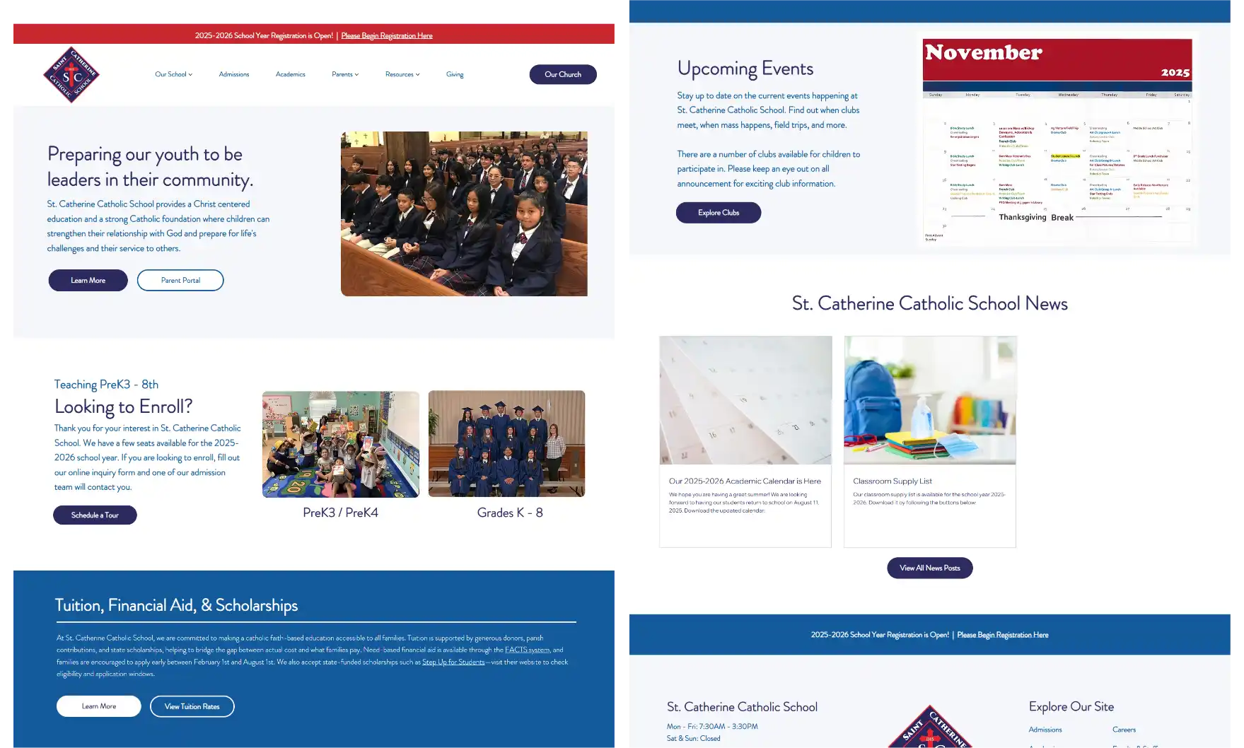
I redesigned the site in Figma beginning with a wireframe that rationalized the navigation and content structure. A CMS was built for the staff directory — creating consistency across all teacher and staff pages while giving the school's admin team the ability to update staff records easily on the backend. The site was built in Wix Studio using Velo for the custom functionality needed to support the CMS.
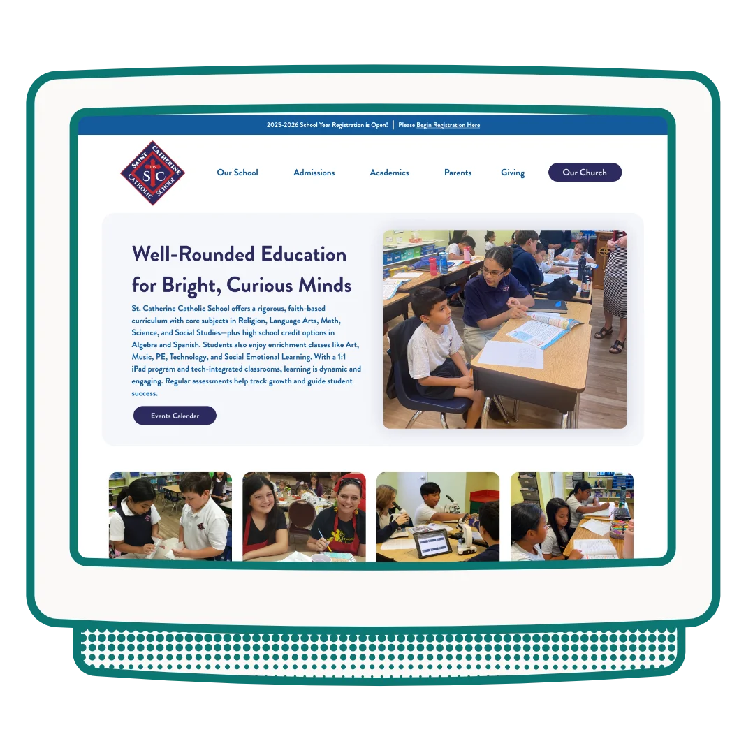
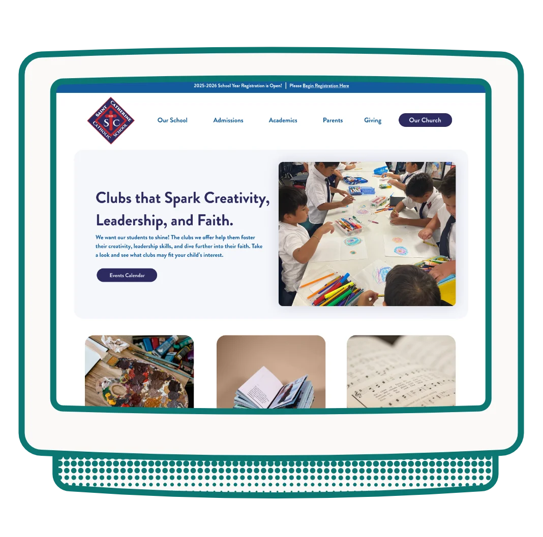
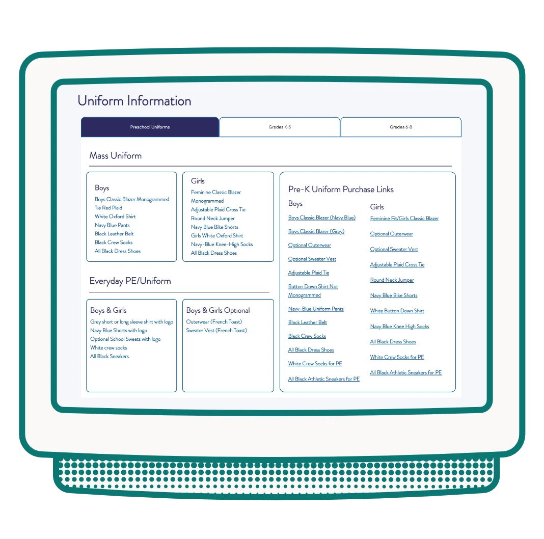
The site launched November 2025 with strong user flows established, a single cohesive type system, logical navigation, and a self-managed staff CMS that scales as the school's team changes. This was a pro-bono project delivered through Get Fish Slapped Marketing Agency.