Brand Development • Web Design • Twin Cities • Pet Services
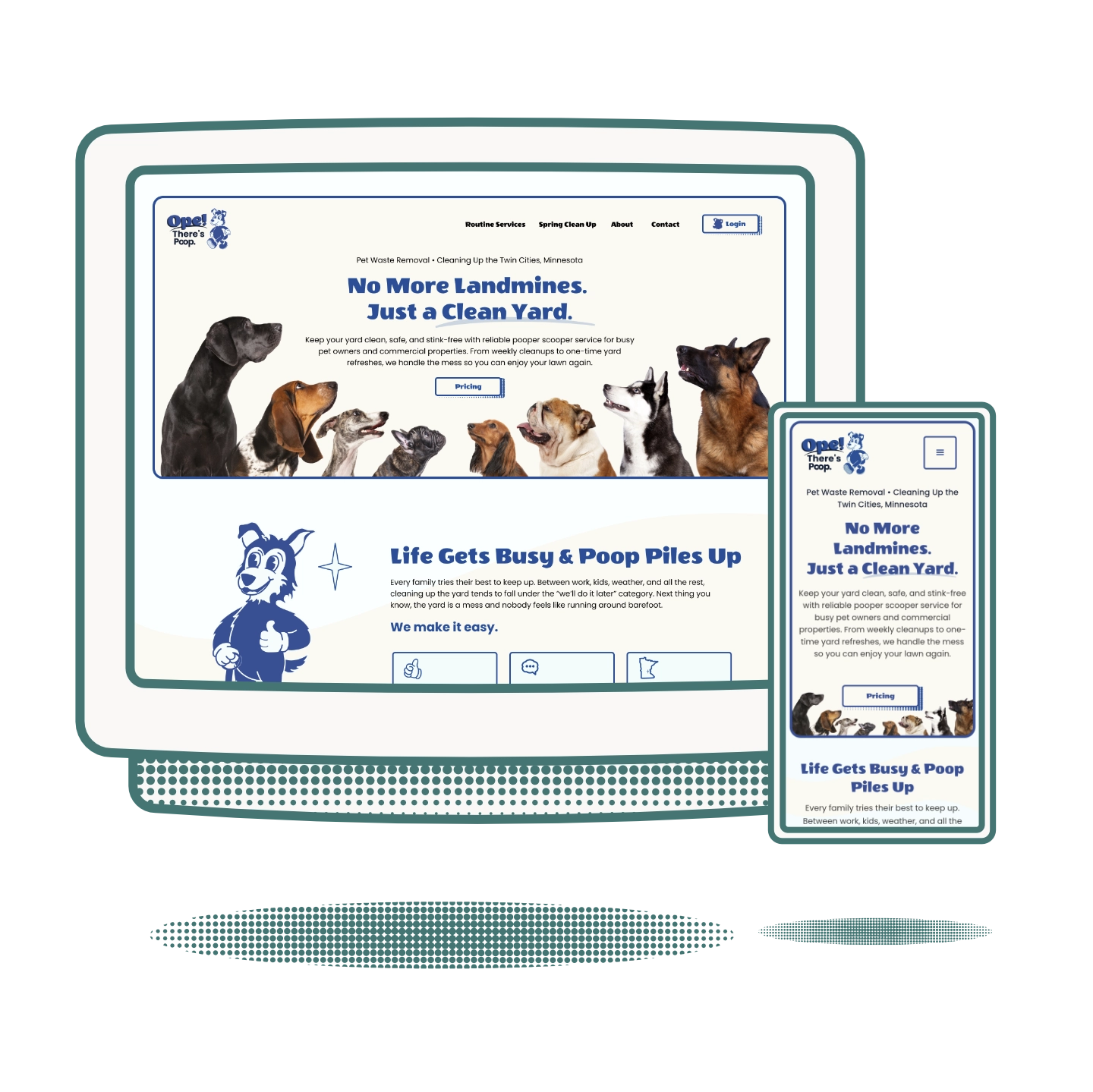
Ope! There's Poop. is a pet waste removal company serving the Twin Cities. The name said everything about their brand personality: irreverent, warm, and distinctly Minnesotan. The challenge was building a brand and website that honored that personality while remaining professional enough to convert homeowners into paying clients. No to mention, launching in a relatively saturated market.
Pet waste removal is a crowded local service market with little visual differentiation between brands. Most competitors default to green, paw prints, and AI generated brands. Ope! There's Poop. had a name that already stood out: the brand needed to match that energy without becoming a novelty act that clients wouldn't trust with their yard. The owners wanted a mascot that was memorable and stood out from the AI slop that existed in this space.
Competitors in this realm all had a mascot logo as well, but lucky for Ope, their competitors didn't invest in their brand. Instead, they used AI image generators to create their mascot. This left the competitors all looking very similar in style, with a thumbs up, and a non-vectorized logo that didn't scale for print.
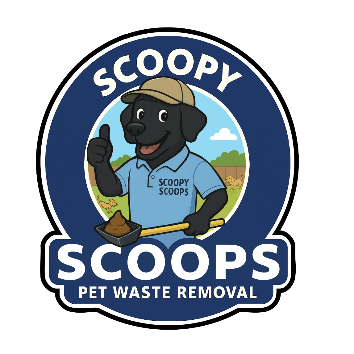
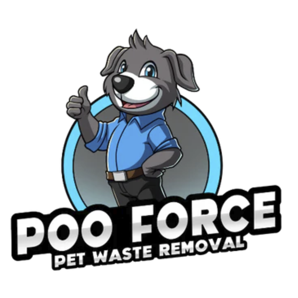
The two logos shown here are real competitors in the Twin Cities market. Both logos feature a mascot, throwing a 'thumbs up', similar typography, and a circle backdrop.
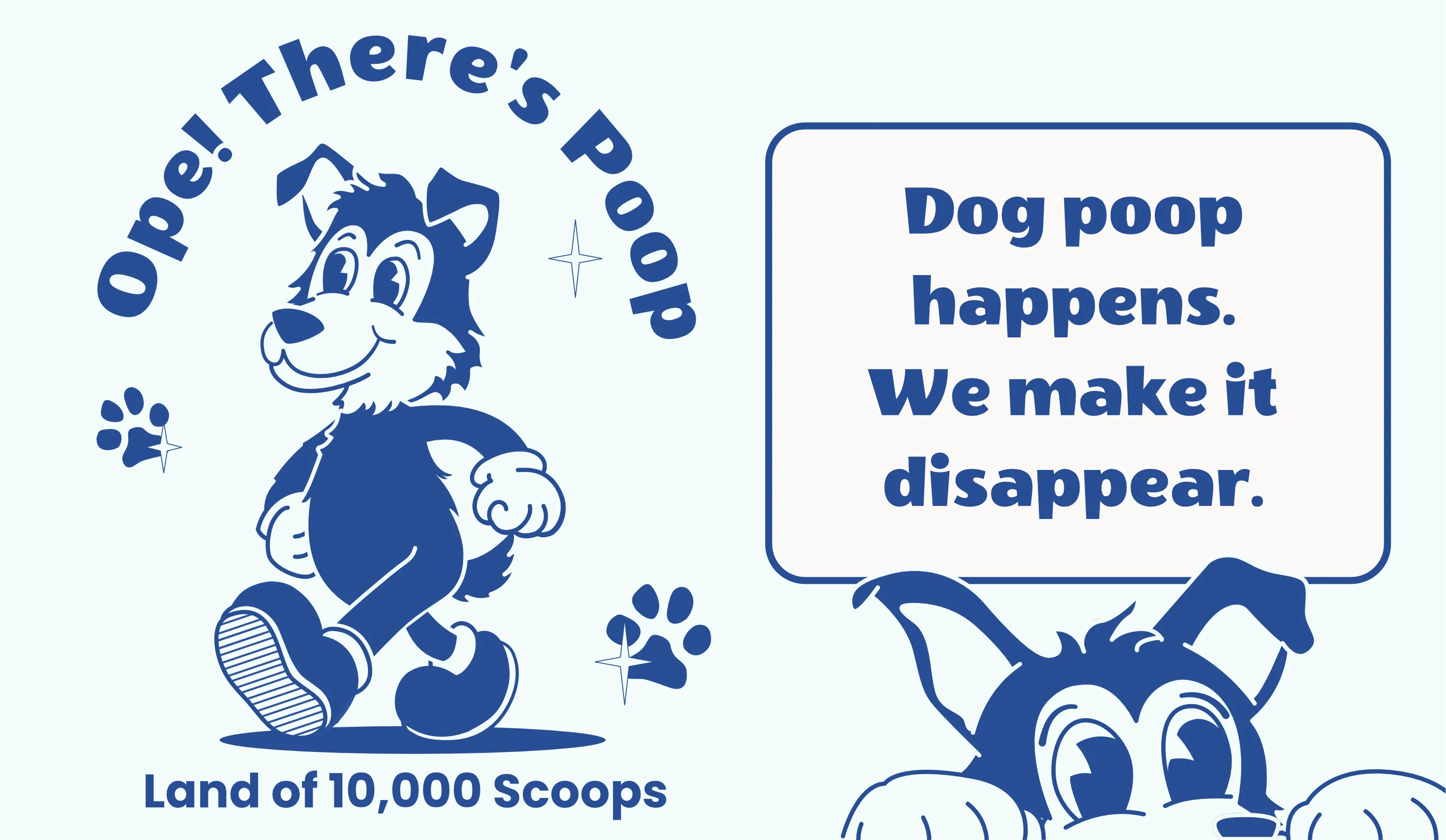
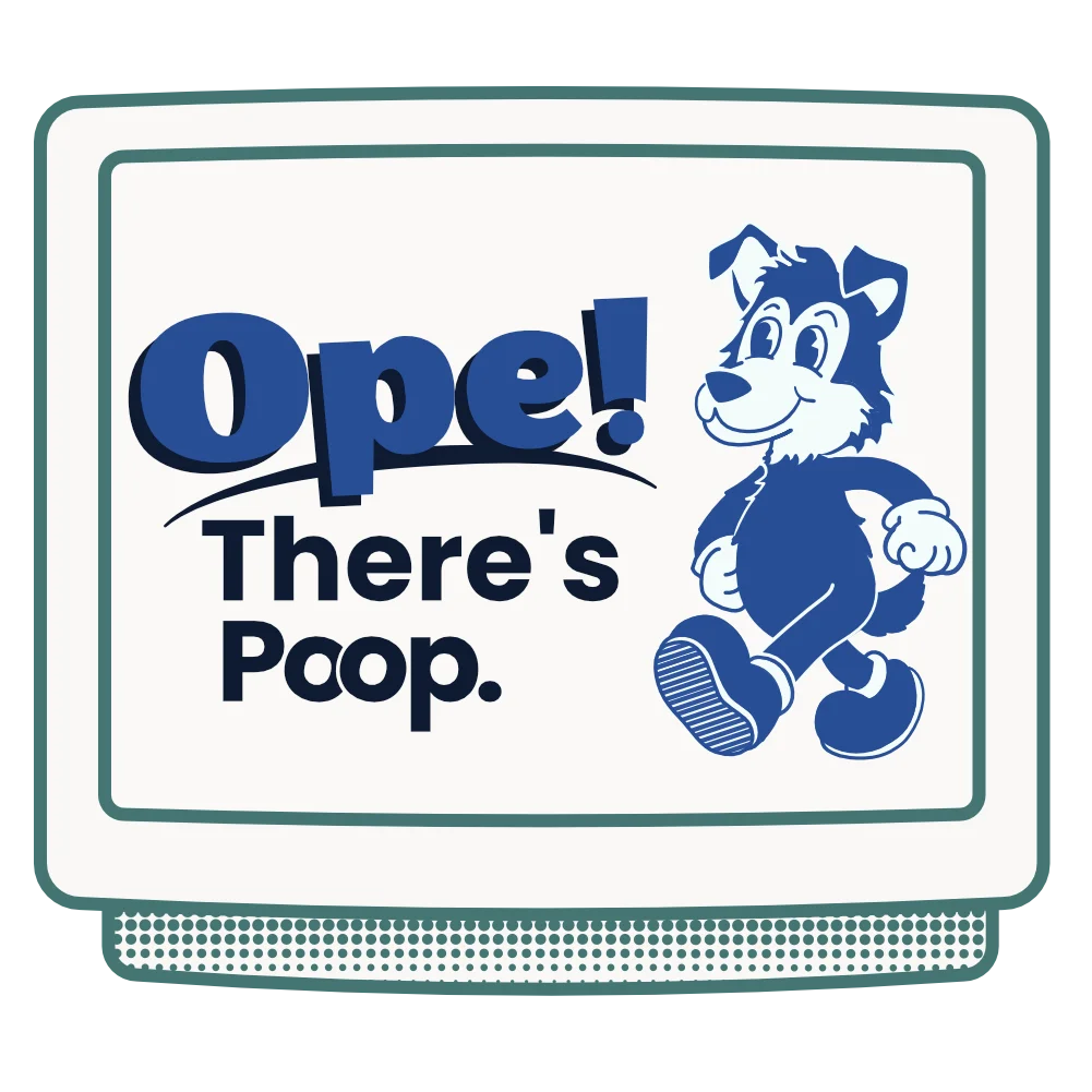
In order to really stand out, I made sure the brand feel leaned heavy into the old sport mascots feel and stayed away from this "modern AI character" that floods our world now.
By limiting the color palette, creating a mascot that leaned into a 1950's character styly, and staying away from the cheesy thumbs up, I was able to create a character that is unmistakably Ope.
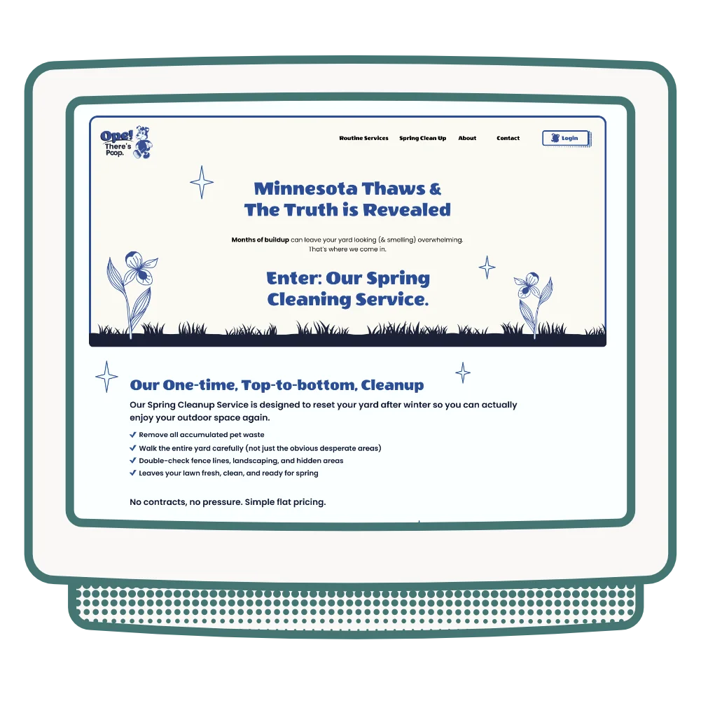
While discussing the overall strategy, we discovered some frustrations from users on other pet waste websites. User talked about the lack of transparent pricing and too much irrelevant information to parse through. I made a simple site with a single call-to-action being "Get a Free Quote". I also placed their package pricing on their website so users could see right away if they were in their price range.
Here are the main items that make this site user-friendly:
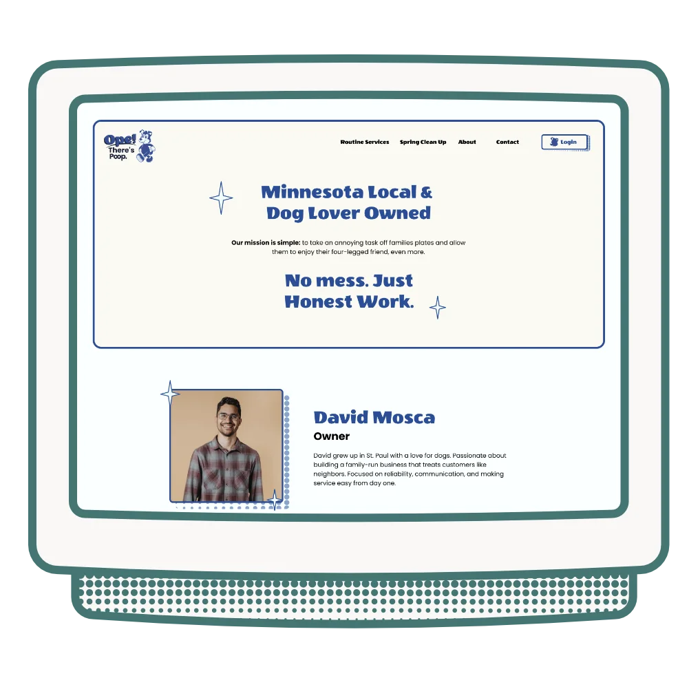
The brand was built around the Minnesotan warmth and humor embedded in the name. The visual identity leaned friendly and approachable: we wanted the colors and typography to feel like your midwestern neighbor, not a corporation. The challenge was finding the line between fun and trustworthy, and being too informal.
The website was designed to convert local homeowners: clear service explanation, transparent pricing signals, easy contact, and a visual personality that made Ope! There's Poop. feel like the obvious choice in a market of forgettable competitors.
Ope! There's Poop. launched with a brand and website that matched the personality of the business, and stood out in a market where most competitors look identical. The site is self-managed and continues to generate local service inquiries in the Twin Cities.
I cannot express how great working with Abigail has been! She brings a professional, fun and creative approach to an otherwise tedious and at times frustrating process! She did such a great job creating our brand and brand identity, making sure our local and family owned tone lead the way. As a fellow Saint Paul native, Abbi knew exactly how to approach the custom web design that we needed to approach our local community. I will absolutely be using her services again and HIGHLY recommend folks consider AMUX Designs for your web design or brand needs!